ShopDreamUp AI ArtDreamUp
Deviation Actions
Description
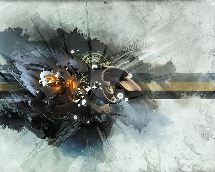
A bit of fun with C4D and Photoshop. A bit more loosening up to get the creative juices flowing again!
Got a couple of collabs in the pipeline - should have those finished quite soon.
Hope you like it!
*EDIT: Wallpaper pack here: fav.me/d2vtrzi
-------------------------------------------
IMPORTANT © COPYRIGHT NOTICE
The work contained in my gallery is copyrighted ©2006-2011 James Knowles. All rights reserved. My work may not be reproduced, copied, edited, published, transmitted or uploaded in any way without my written permission. If you have any doubts about this matter, or requests email me at jaykay73@hotmail.co.uk
Image size
1000x800px 694.99 KB
© 2010 - 2024 GrungeTV
Comments63
Join the community to add your comment. Already a deviant? Log In
I hope I rated you fairly. <img src="e.deviantart.net/emoticons/l/l…" width="15" height="15" alt="
That aside..
The first thing that stuck out to me was the originality of the name. Incredibly intriguing, made me instantly curious about the work. So props on that.
Secondly was the contrast in dimensions. I love a good 3D wallpaper, but what I love more is when an artist uses both 3D and 2D in the same work. It gives the image an entirely new depth. Specifically I am referring to the 2D lines that cut through the 3D waves in the middle.
Another few things that stuck out to me:
How you used a "cut up" sort of technique. I always love when this is used in a digital piece, and you used it just right.
The orange glow? Fantastic.
Finally, one thing that struck me as odd was the fractal "spines" that stick out from the 3D centerpiece. While it's a nice touch, they seem a little too faded, or at the very least, too see-through. A suggestion I would have is to slowly fade them as they move out from the centerpiece, not keep them faded the same way throughout.
Lovely piece, can't wait to see more!


